Upwise is MetLife’s $22M proprietary financial wellness and benefits platform designed to help employees choose and use their benefits more effectively — from health coverage to financial planning. Built in response to a national trend of benefit confusion and underutilization, Upwise empowers employees with personalized benefit recommendations, proactive reminders, and interactive tools to maximize their coverage year-round.
As the lead designer on a 5-person team, I drove the full product design sprint, strategy, and iterative UX process from zero to launch.
The Problem: Complex Benefits, Poor Engagement
Employers invest thousands per employee each year in benefits, yet:
53% of employees say they don’t understand their benefits
45% say they’re confused during open enrollment
Benefit utilization is often reactive — not proactive — leading to waste, stress, and low ROI
We saw a massive gap between investment and impact. Upwise was designed to close that gap with a modern, intelligent, and engaging financial experience.
The UX Challenge
Benefits software typically falls into two buckets:
Enrollment engines with clunky forms
Financial tools with no understanding of insurance or life events
Our goal with Upwise was to combine these into a single platform that could:
Educate users contextually (not overwhelm them)
Make benefit decisions emotionally intelligent
Drive year-round value, not just during open enrollment
Research & Persona Development
We collaborated with MetLife’s data science and HR benefits teams to define target users across industries. We mapped out archetypes like:
Name
Role
Challenge
Desired Outcome
Sara
HR-employed millennial mom
Planning for family while budgeting
Holistic benefit insights
Jerome
First-gen grad
Navigating insurance alone
Step-by-step guidance
Diana
Gen X mid-level manager
Too busy for plan deep dives
Smart defaults & reminders
We layered user interviews, employer feedback, and behavioral analytics from previous tools to prioritize emotional drivers behind benefit engagement: protection, confidence, financial control, and life event readiness.
The Process: End-to-End Product Sprint
I led a 6-week design sprint encompassing:
Phase 1: Discovery Workshops with MetLife HR clients, brokers, and employees
Phase 2: Strategy Defined a core product vision:
“A benefits engagement platform that works for employees — not just during open enrollment, but thoughout life “
Phase 3: Rapid Prototyping
Mobile-first Figma flows for onboarding, dashboards, nudges, and health integrations
Iterated on visual hierarchy to balance financial data with action cues
Phase 4: Testing & Validation
Remote user testing with 25 participants
High-fidelity walkthroughs for employers to approve messaging tone and benefit logic
Heuristic audits for ADA compliance and financial literacy clarity
Core Features
Personalized Benefit Selector
Instead of making users sort through long PDFs or option trees, we built a smart selector using:
A quick survey on health, life plans, and money habits
AI-powered logic to recommend customized benefit bundles
Clear reasons behind each recommendation (“You said you’re planning to have a baby”)
Life-Event-Based Nudges
We introduced smart notifications to guide employees throughout the year, not just in November.
Example:
“Sara” indicates she’s expecting a child during open enrollment. → Months later, Upwise detects medical claims and sends a nudge: “You’re eligible for Hospital Indemnity benefits. Want to learn more?”
We mapped dozens of life events — from moving to illness — and tailored benefit actions accordingly.
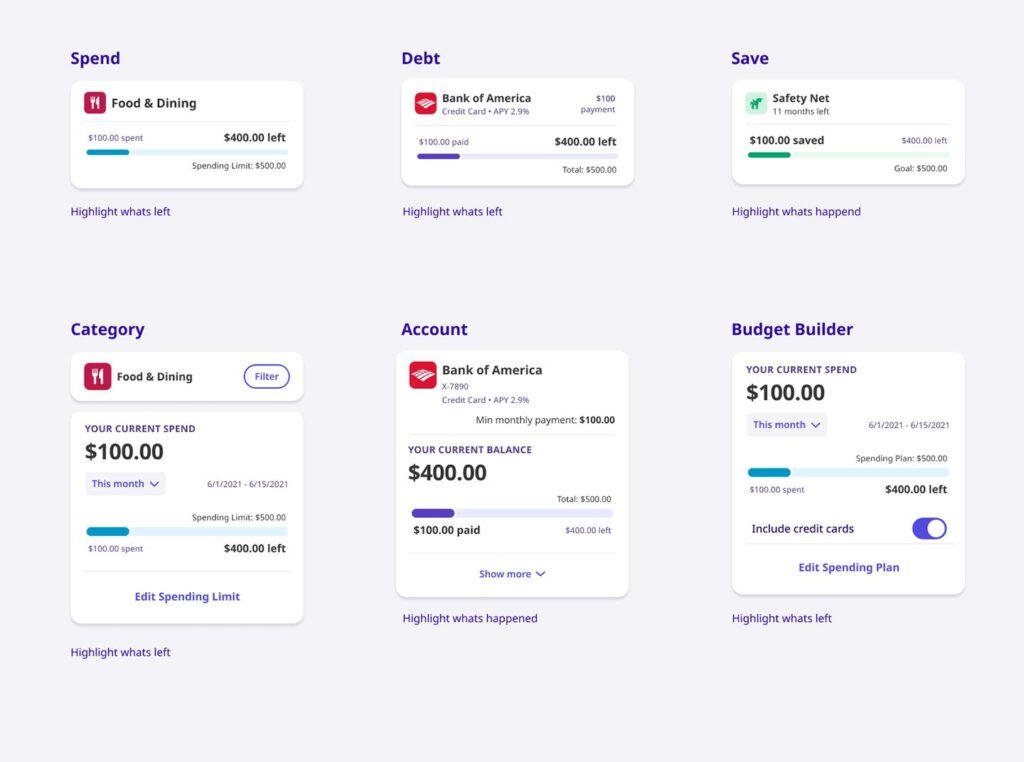
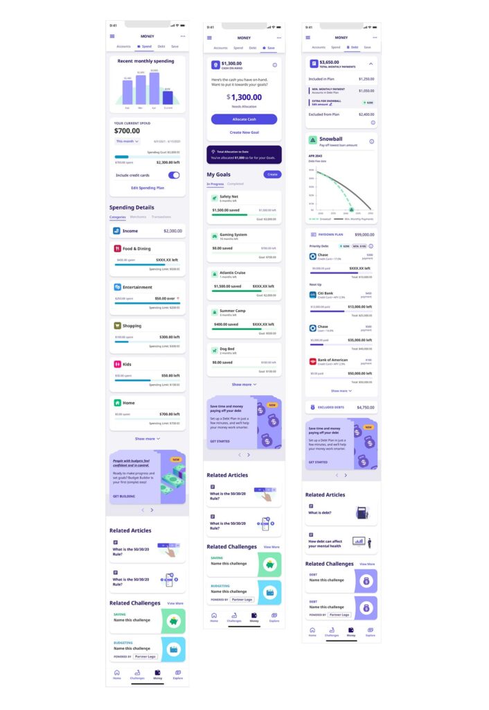
Financial Confidence Layer
Beyond benefits, we layered in budgeting and debt visibility:
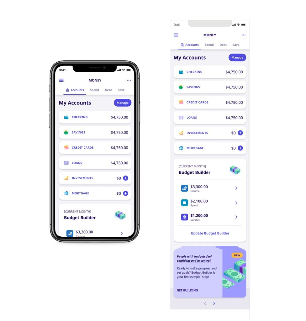
Unified view of checking, savings, credit, loans, and investment accounts
Modular “Budget Builder” that breaks down spend, surplus, and recommendations
Gamified challenges tied to saving goals and employer programs
Concierge Experience
We didn’t just design a platform. We created a “concierge” model:
Human support when AI couldn’t help
Tailored insights based on MX financial data integrations
“Explain it like I’m five” breakdowns of terms like deductible, copay, HSA
UX Design Systems & Leadership
Led the creation of a design system to ensure scalability across future employer clients
Built Figma component libraries in tandem with engineering
Facilitated design reviews with MetLife’s internal brand and compliance teams
Our system supported:
ADA standards
WCAG 2.1 accessibility
Localization and plan customization
Iterative Learning & Testing Outcomes
We ran 3 rounds of usability testing, each informing product decisions:
Insight
Change
Users misunderstood plan differences
Added tooltips and side-by-side plan visuals
New hires missed benefits deadline
Introduced smart calendar reminders and push alerts
Budget builder felt “too advanced”
Split into basic and advanced modes
We saw:
2x engagement on day 1 vs. MetLife legacy tools
3x more users saving at least one financial goal
25% of employees used their benefits within 45 days of enrollment — a major uplift