
MenuClose
The Process:
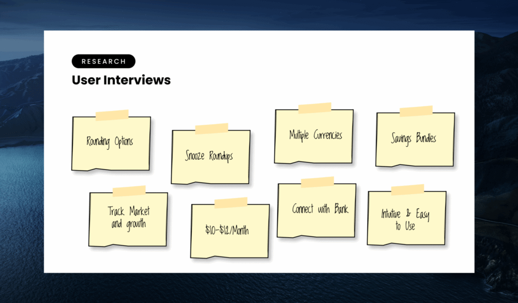
Research:
Every good iterative product starts with research. Once you understand your user, you understand what they need, and ONLY then are you equipped to build for them.
We started out with a comprehensive competitive analysis to consume as much info as we could. We learned where competitors were falling short, what they were doing well, and read through thousands of reviews to understand more of the need around easy crypto investing.
This gave us a starting point to start building our ideal persona, and a list of questions we needed answers for. How educated are these investors? What do they care about when choosing their first crypto investment? How much do they have to invest?
We took these questions to dozens of interviews with friends, families, random people at bars, servers at Chipotle and more, to further expand our understanding of the need. It’s important to get raw and live data with real people to get a grasp on solving problems you think they might have, and uncover problems you never thought they had.
This helped to solidify our ideal persona and gave us a fantastic waypoint on our new crypto investing journey map.
Journey GPS:
Next we had a more daunting task. More waypoints to create a comprehensive journey GPS.
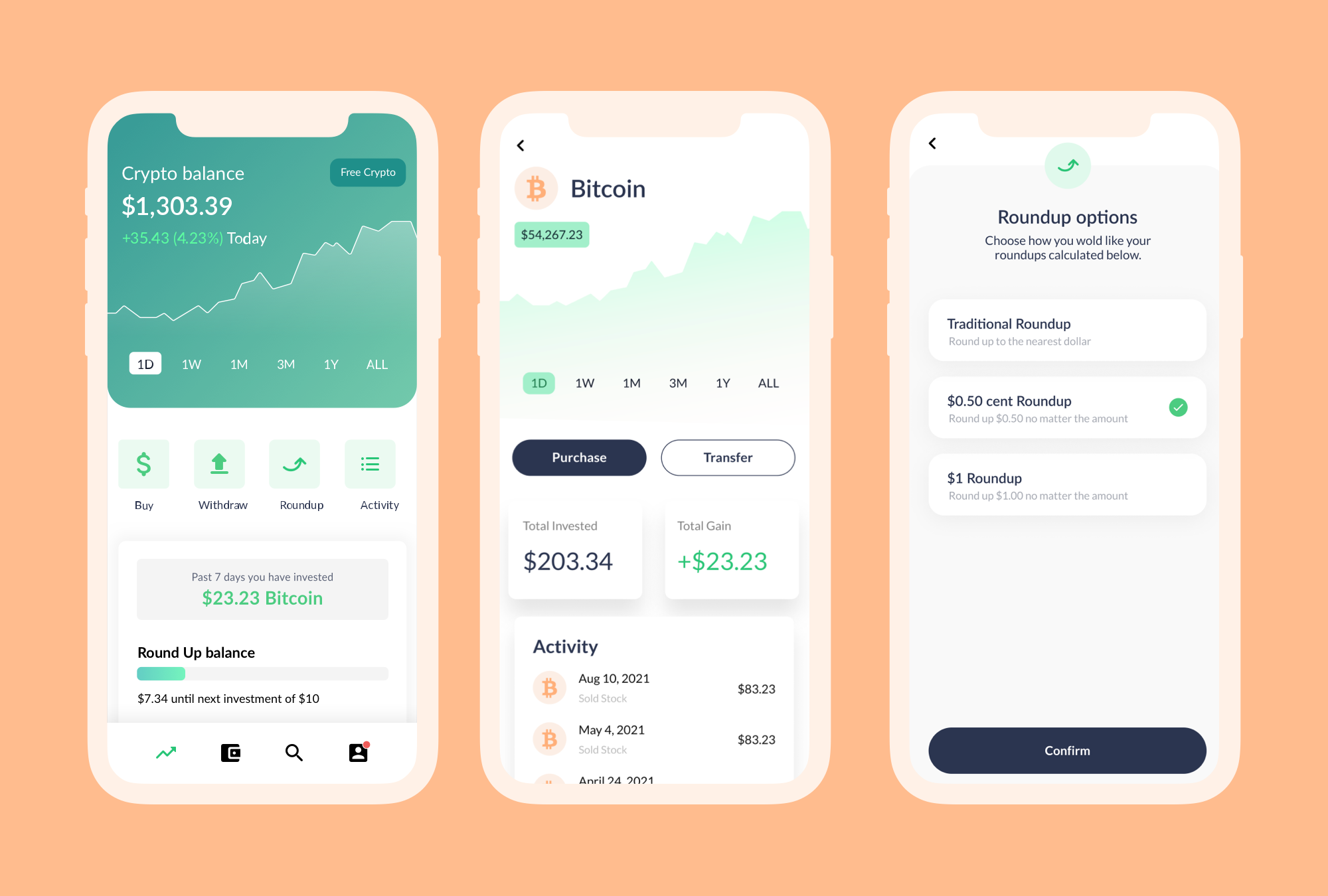
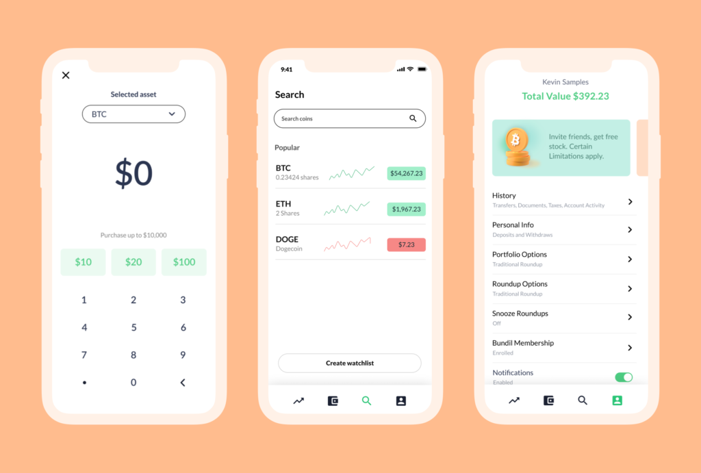
We started with core pillar journey’s we knew were needed for the base functionality of the app. Things like onboarding and KYC (Know Your Customer info required by the SEC for brokerages), on and off ramping so users can get funds in and out of assets within the app, portfolio management to see how assets are doing individually and with respect to the portfolio, and more.
We also used our initial research to come up with a base feature set of automation, where the Bundil product took its first breath.
After defining a list of journeys throughout the experience, we had enough waypoints to start using our GPS.
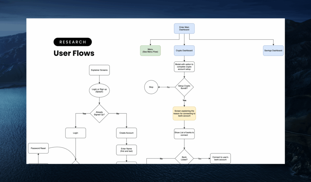
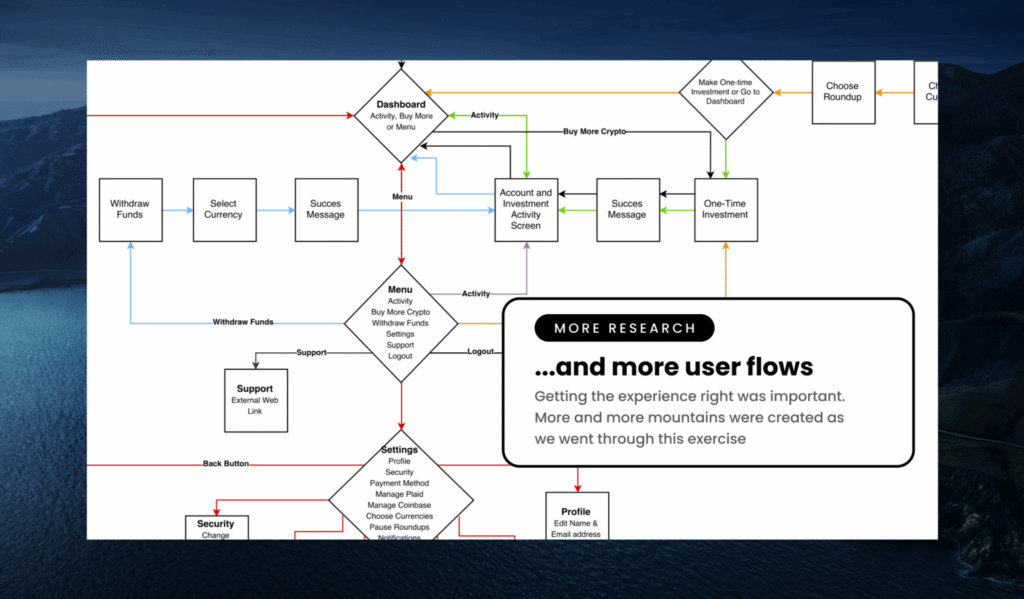
User Flows:
Every good GPS has clear, concise and speedy routes to the destination. We created flows to know exactly how a user is going to interact with each feature, and navigate through all aspects of the app.
This step is often overlooked in the process, but provides a great opportunity to uncover edge cases and breaks within the experience. We learned through this process that we may have some pain points for certain demographics.
We developed detailed user flows for every core interaction, revealing dozens of friction points, especially around:
Partner bank coverage
Currency selection during onboarding
KYC rejection paths
This helped us shape fallback states, error handling, and user education moments.
Compelling Stories:
Next, we need to translate our vision to designers. What better way to communicate than a story? I believe conduits between product, design, and engineering are vital to successful teams. We put extra effort in crafting explicit, defined, and compelling user stories for our designers to truly understand the vision.
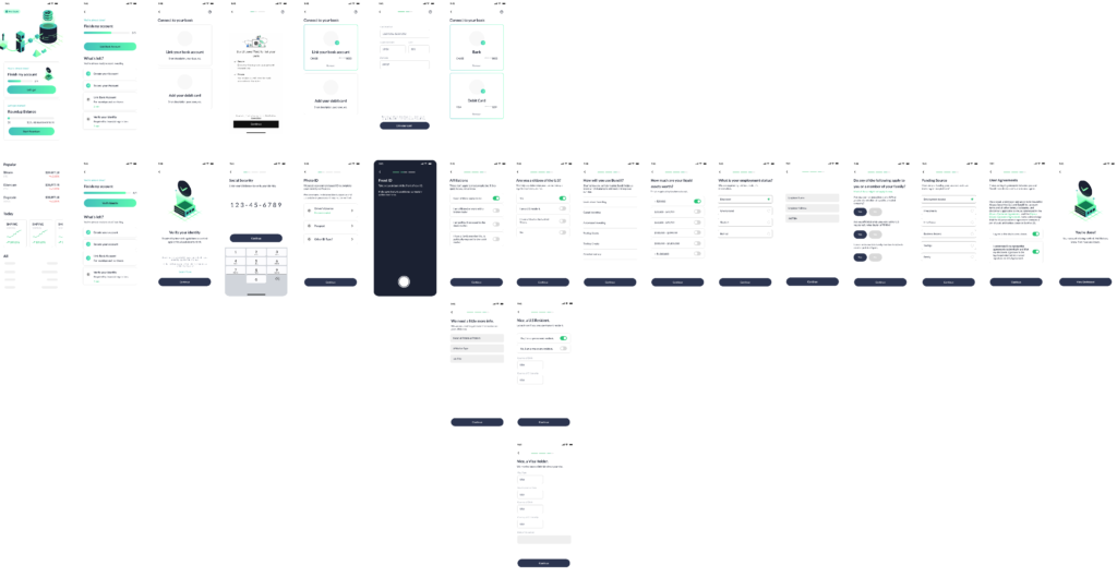
Wire-framing to Low and High Fidelity Designs:
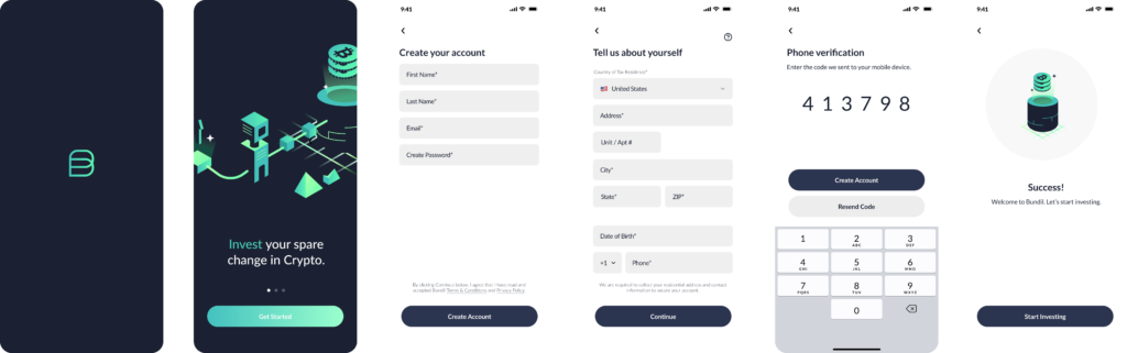
The design process was delightful and fun. We finally took this initial work and starting framing the visual architecture for Bundil.
We started out with wire frames of each screen as a base to work from. Here, the value of product leaders being individual contributors shines through my unique process. I got in and pushed pixels to start bringing Bundil alive.
Once we got our prototype done, it was time for the digital race.
The Marathon:
With defined acceptance criteria in hand, it was time for our marathon. A culmination of sprints to give birth to Bundil.
As a former engineer, I was uniquely suited to guiding the team throughout the development process. We ran through a process similar to the product lifecycle, but with speed, scalability, and efficiency in mind.
At this point during the process, we found out we were going to be featured on ABC’s Shark Tank, so we knew the world would be watching us run.
We found the perfect partners to satisfy our brokerage, KYC, and processing requirements, and implemented a full analytics suite to prepare for fast and informed iterations.
Iterations:
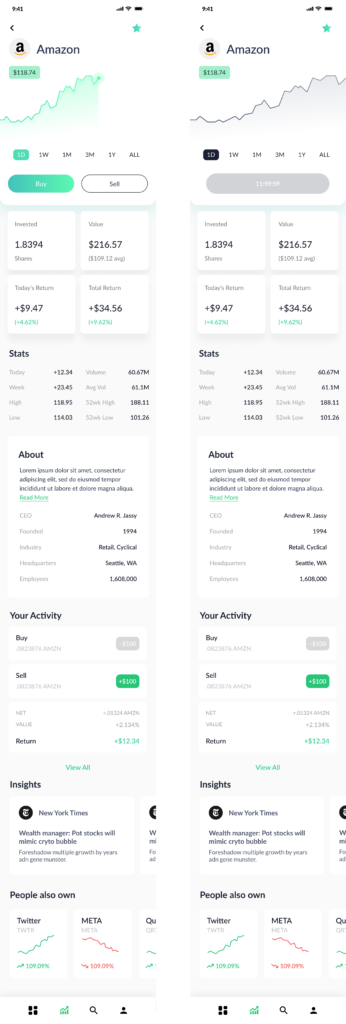
After launch, we went through numerous iterations to expand the feature-set, and encompass more of the market.
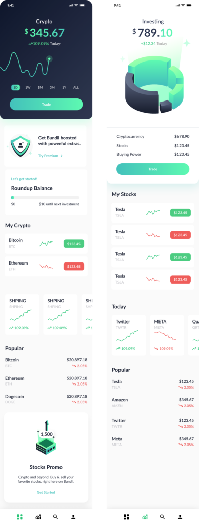
Below you’ll see the core product, along with stocks, and different app states to handle timing regulations with traditional securities.
Product Strategy & Reflections
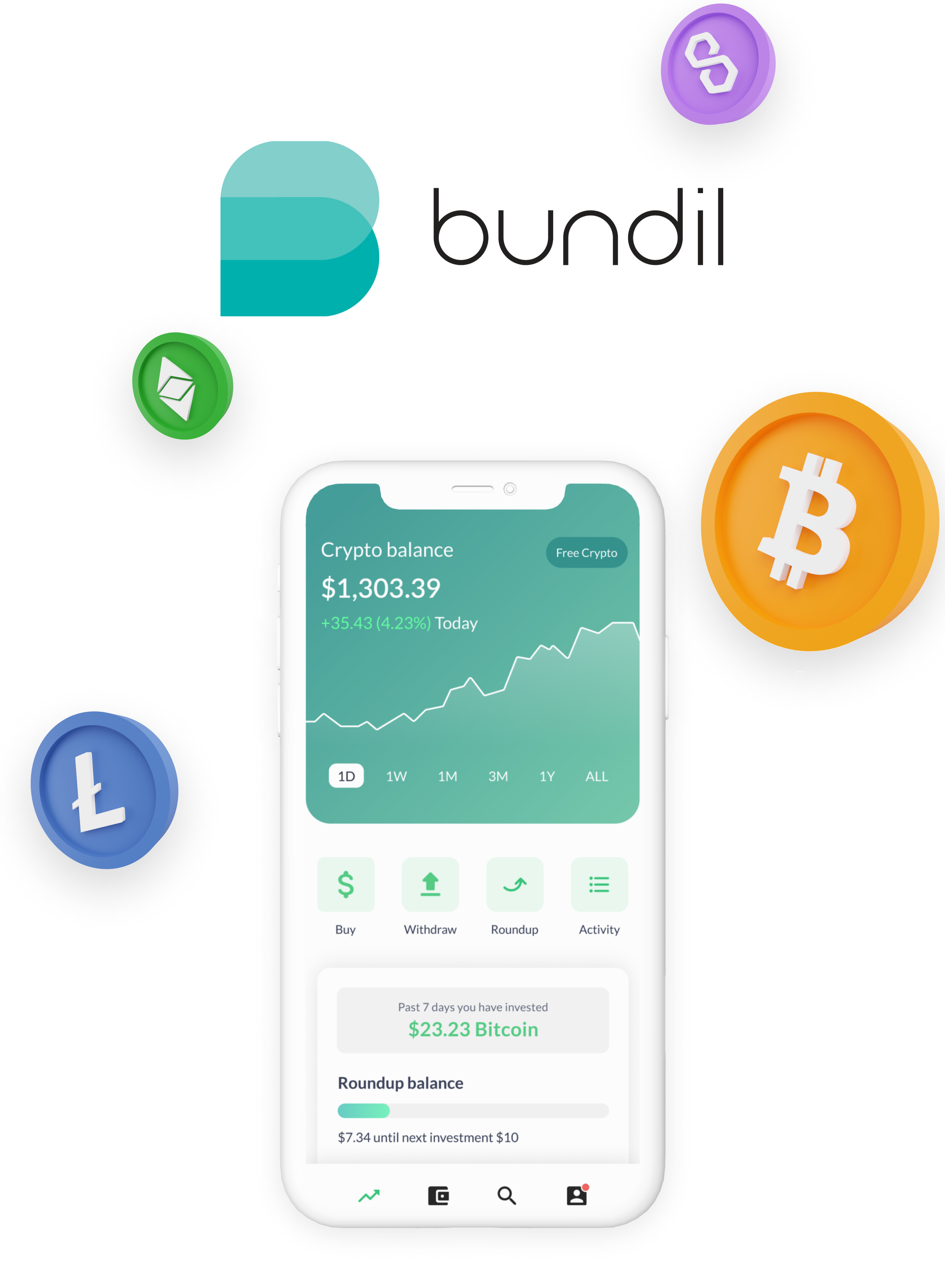
Bundil started as a novel idea — helping users passively invest spare change into cryptocurrency — but the strategy was never just about rounding up pennies. It was about lowering the barrier to an intimidating new asset class by making investing feel as familiar as a coffee purchase.
Here’s how we thought beyond UX to position Bundil for scale, trust, and market fit.
1. From MVP to Multiproduct: Learning Our Way into Stock Support
The original thesis was simple: crypto investing was too complex, and we could solve that with automation. But once we launched and scaled to 100,000 active users, our user data told a more nuanced story.
We saw two signals:
Power users started asking for more control — including allocation customization and asset-level management.
Churn analysis revealed that some users still felt crypto was “too volatile” — especially in down markets.
We ran follow-up surveys and segmented feedback by crypto conviction levels. The insight was clear: to serve a broader audience and drive long-term retention, we needed to expand beyond crypto.
That led to our integration with Alpaca Markets, giving users access to traditional equities through the same spare-change flow. We added app states and timing logic to handle trading-day constraints, SEC rules, and fractional share mechanics — without complicating the core UX.
Bundil stopped being “a crypto app.” It became a diversified micro-investing engine, with crypto and stocks as modular endpoints.
2. Liquidity Lessons: Switching Crypto Providers to Enable Scale
One of the less visible but critical product decisions came down to liquidity infrastructure.
Our initial provider Wyre was good enough for early-stage volume, but once Bundil started gaining real usage — especially post-Shark Tank — we hit limitations:
Slow KYC approval times
Limited trading pairs
Higher-than-expected slippage
We started benchmarking against user support tickets and trade performance. The friction was real, and it broke our core value promise of “invisible investing.”
So we began testing other liquidity providers in a sandbox environment, focusing on execution speed, API uptime, and spread consistency. Eventually, we migrated to a more scalable crypto liquidity partner that offered faster settlement and better coverage — critical for earning user trust during volatile markets.
Key learning: Seamless UX means nothing if your infrastructure fails in moments of stress. Liquidity is product.
3. Shark Tank as a Go-to-Market Engine (and Growth Loop)
After we found out Bundil would appear on Shark Tank, we knew we weren’t just getting airtime — we were getting an asymmetric acquisition moment. But to capitalize on it, we had to treat the show like a product feature in itself.
Here’s what we did:
Built a “TV-ready” funnel, including a fast onboarding flow optimized for mobile conversions during the episode airing
Designed a pre-roll waitlist experience and post-show drip to re-engage leads
Integrated app store campaigns and retargeting to coincide with rerun schedules
The real unlock came in the growth loops we designed around the show:
Early adopters referred friends by saying, “I found this on Shark Tank” — which carried built-in social proof
We leaned into earned media and community posts where fans of the show shared their favorite apps from the episode
Email subscribers from the show became a high-conversion remarketing segment for new features (like stock support)
Strategic frame: Instead of just riding the Shark Tank wave, we built systems to amplify and sustain it.
4. Building in Iteration: From Passive to Engaged Investing
Bundil’s UX was intentionally simple. But under the hood, we tested constantly — from tone of copy, to default allocation behaviors, to educational nudges. And the feedback loops shaped product direction fast.
Key iteration examples:
Introduced portfolio rebalancing suggestions after seeing users manually change allocations weekly
Added educational tooltips based on drop-offs during asset selection
Adjusted round-up logic thresholds to improve perceived “progress velocity” in early weeks
Over time, we realized that “set it and forget it” wasn’t enough. What users actually wanted was low-friction control — tools to feel in control, even if they didn’t want to micromanage.
That insight drove feature expansion around asset toggling, real-time portfolio snapshots, and risk-adjusted bundles.
North Star shift: From “investing without thinking” to “investing without stress.”
5. Infrastructure as Differentiation
As the product matured, one of the most important (and least visible) strategic levers was our investment in back-end tooling. We built:
A modular investing engine that could plug into crypto, stocks, or even future assets like ETFs
A real-time risk assessment layer to flag user behaviors (e.g. over-weighting volatile tokens)
A flexible KYC fallback system to reduce drop-off from ID verification — critical for conversion
These were not “features” in the classic sense, but they were compounding infrastructure bets that made future pivots cheaper and faster.